One of Stimulant’s specialties is designing experiences on new, next generation hardware. We were recently tasked with designing an interface for a 4K display, and we discovered a few things during that process that could give others a big head start.
What is a 4K display, exactly?
By definition, 4K resolution is a generic term for display devices or content having horizontal resolution on the order of 4,000 pixels. That’s why, if you do some quick math, you might say to yourself, “Hey, Self, wait a minute! If I double a resolution of 1920 x 1080, that doesn’t add up to 4000px!”
There are a few screen resolutions that are considered 4K, and not all are exactly 4000 pixels across. For example, UHD (Ultra High Definition or Ultra HD) is a standard for most consumer 4K televisions and has a resolution of 3840 x 2160 (double the size of current HD, 1920×1080). This is the most commonly used 4K standard and the one we are focusing on here. Just know that other formats exist, such as the Digital Cinema Consortium’s DCI (Digital Cinema Initiatives) specification of 4096 x 2160. Both UHD and DCI are considered 4K in terms of general shorthand.
In short: If you are driving or receiving display specifications, be specific about what flavor of 4K you mean or want!
TIP: Consumer 4K displays for video are becoming more commonplace, and there certainly are larger computer monitors in the 30” range that can reach these resolutions. However, if you – like us – are designing media for an installation, remember that consumer 4K displays usually run at 30Hz…plenty for a Blu Ray player or digital cable, but not enough for many high-performance computer graphics cards. If you’re blasting digital pixels to a 4K display from a computer, ensure that your display supports 60Hz refresh rates for the best performance.
Look Sharp!
Just like the HD video standard (also known as 1080p), 4K defines a set of pixel dimensions and has nothing to do with the physical size of display. Therefore 4K doesn’t tell you anything about pixel density, per inch or per millimeter: That’s a mix of pixel dimensions and physical dimensions.
Therefore, 4K displays allows for either small-to-normal-size, near-retina-display pixel density or normal pixel densities for very large screens. This is great for personal-scale devices, but even better for us here at Stimulant, where clients often want quite large digital installations with large screens.
When we are designing a large touch wall, for example, one of the biggest challenges and disappointments is how type looks on a large touch-enabled 1080p display. These devices are intended to make video imagery look great at 10 feet away, not digital typography at less than two feet away! With a 4K display, this is much less of an issue because, if a 4K display is the same physical dimensions as a 1080p HD screen, you are packing twice as many pixels into the same physical space, making things look much sharper.
TIP: Since 4K is twice the resolution as 2K, type sizes in points will be twice the size to make up for the extra pixels. Be sure to do the math on a 4K display’s actual resolution (divide its horizontal width by its horizontal pixel count – more on this later): This final resolution will also influence what point size designers use, since 4K screens rarely have a final resolution of 72dpi. Measuring type in real units (inches or ems) can be better than in pixels.
Stay Flexible
Sometimes graphics and layouts from the standard-resolution world need to be able to scale up to 4K. (Or larger: We’ve done projects where one app had to run and perfectly on both a tablet and an 8K x 8K video wall.) This is where resolution-independent layout rules and imagery can really save the day.
If layout flexibility or responsive design is important to the outcome of your project, and you want your designs to scale smoothly, use vector art as much as possible. Only use raster graphics if you have to. Depending on your project’s run-time environment, this may be easier said than done. There are more tools for using vector art in native apps or graphical frameworks than in, say, HTML5, where the only resolution-independent tools you have are CSS objects and SVG (scalable vector graphics). CSS will only get you so far, and SVG assets are a lot less common than JPGs and PNGs.
Assemble the Search Party
One of our biggest challenges was around representing media and image content, even simple placeholder or FPO (for placement only) imagery. Side note: What did designers do before Google Images and Flickr? Those poor, poor souls!
When creating mock-ups for 4K displays, it’s not difficult to use the Internet to find high-resolution FPO content such as photography, since digital cameras have been able to shoot 4K (and larger) images for almost a decade. The real challenge is finding commercially released or published content like book covers, album art, TV and movies. Standards as varied as digital projectors, offset printing, and even Amazon.com’s standard thumbnail sizes drive standard resolutions, most of which are woefully insufficient for the resolution demands of 4K. (This is changing slowly thanks, in part, to the advent of ultra-high definition displays on modern laptops and tablets.)
This means that you will most likely have to spend more time creating content from scratch, which should be considered when estimating your time. When it comes to media or video content, scaling 1080p video to 4K actually doesn’t look too bad for the purposes of demos or prototypes. It will obviously not be as sharp as native 4K video, but if you have to go there in order to create a high-fidelity mockup, it’s not the end of the world. 4K displays and the increasing prevalence of high density device displays create significant challenges for publishers and content providers as they try to ensure that their content meets modern resolution requirements!
Consider this: Remember that your geometry teacher taught you that doubling the dimensions of something quadruples the surface area? 4K images have four times the number of pixels than a 2K or 1080p image. This may raise issues of server-side delivery speeds if the assets aren’t hosted locally. 4K visuals may quadruple your RAM, scratch disk, or runtime graphics needs compared to standard HD visuals.

You Better Check Yourself
As designers, it’s as important to test our work on actual production hardware as it is for developers to test their code. We like to make sure things are sized properly and feel right, but while 4K displays are coming down in price you might not always get access to one before you start to design work. Plus, they can be hard to fit on your desk while testing or reviewing!
One trick we learned from working on other very large (and very small) scale displays is to print out our work at the proper scale. We’ve used this technique for everything from massive multi-projector projects like Intel’s “Connect to Life” experience at CES to the tiny 1.5” x 1.5” displays for Sifteo’s “LoopLoop” app we designed.
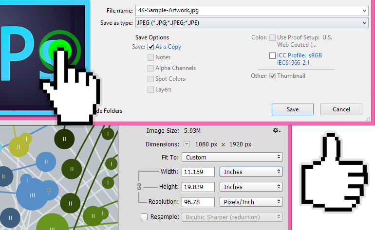
TIP: Using Photoshop’s “Image Size” to test final sizes. Before you begin, you need to know some simple specs…
- Width and height of the 4K display in inches.
- If you only have the diagonal size (like 46”,) you can find the width and height by using a conversion tool such as this.
- The width and height of the 4K display in pixels. Because you read the first paragraph of this article, you should know what that is!
- Once you have the width and height in both inches and pixels, you can find the DPI by dividing the width in inches by the width in pixels. Width (inches) / Width (pixels). For example, if my project uses a 46” display, the width is 40.09” and the width in pixels for a UHD display is 3840. 40.09 / 3840 = 95.78 dpi
Now you’re ready to rock in Photoshop.
- Launch Photoshop.
- Save a copy of your working file or save a jpg/png of the artwork you want to test.
- Open the file in Photoshop.
- Go to Image > Image Size.
- With “Resample” turned OFF, change the resolution to whatever you came up with on step 3.
- Press “OK.”
- Now, print that out.
If you follow these simple steps you will get a very good sense of how big your type will be and a general idea for how sharp things will look. It’s not 100% exact, but it’s as close as you will get without actual hardware.
Summary
Designing for 4K displays is just one example of how Stimulant is always investigating how to render visuals and experiences for our users with new and emerging technologies. We hope that some of the lessons we learned can help you start off on the right foot.


