At Stimulant, we love touchscreens, data visualization, and data-driven, procedural graphics. Genentech’s BioOncology group brought us a project that allowed us to combine all four, whilst retooling how clinical oncologists visualize and understand medicine development pipelines.
We thought we’d run down some of the techniques we used to design this interactive data visualization, focusing on planning and designing digital experiences on large scale monitors, rapidly prototyping with low-tech tools, and speeding up labor-inducing tasks.
Every year, the rock stars of the cancer research and treatment world put on their shiniest shoes and assemble for the American Society of Clinical Oncology (ASCO) conference. In honor of the 50th anniversary of the ASCO conference, Genentech’s BioOncology group asked Stimulant to design and develop a unique way to view and interact with their drug development pipeline. This pipeline represents all the molecules currently being researched and tested to treat various tumor types, each of which can be organized by tumors they may affect, the biological mechanism of their action, and the phase of testing they’re currently in.
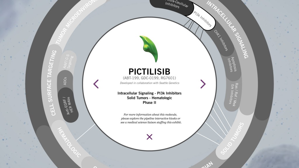
Every ASCO exhibitor shows their development pipelines as printed bar charts that focus on which phase of testing each medicine is in. We asked, while this was important, was there a more relevant way that oncologists could look at this data, based on their personal and professional interests?
Some oncologists specialize in certain tumor types, while others focus on how certain medicines act upon the body. We wanted to allow all booth visitors to select their own area of interest, streamlining their experience while delivering valuable metrics to Genentech.
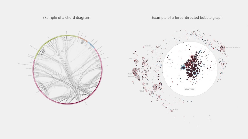
We decided to create an interactive “Pipeline Explorer” that was a hybrid of a chord diagram and a force-directed bubble graph. What’s more, a circular form echoed the shape of Genentech’s overhead signage, making it visually cohesive with the design language of the greater booth. The Pipeline Explorer reveals the breadth of molecules in development, while enabling visitors to quickly target content of interest, and encounter additional content through exploration.
We also decided on a 2-screen system: One 32” touchscreen would act as the input device and user focus. An 80” display would show a derivative screen state, showing large activity to passersby without violating any federal, medical, or tradeshow regulations. We did some quick design hackery in Adobe Illustrator to reverse-engineer how large the tradeshow floor was from a PDF floorplan, and determined that we wanted to make sure the primary text on the 80” screen was visible 50 feet away. And, of course, we needed to ensure that all touch areas on the 32” screen were accessible and ergonomically sensible.
But, even at Stimulant, one doesn’t always have an 80” display laying around.
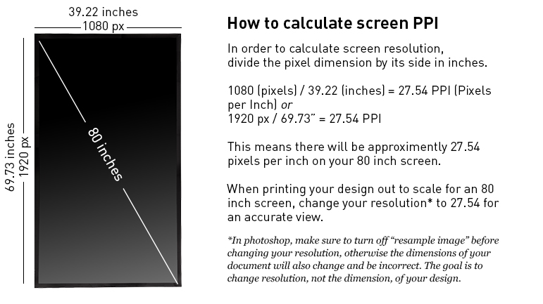
We printed out our designs on paper. Making a paper prototype allows us to test the legibility of type at various distances, helps confirm our buttons are large enough to touch, and allows us to determine relationship from visitor to input device. In order to make a test print, you must make sure you are printing at the same spatial resolution as your final screen device. (Remember that spacial resolution is density of pixels, not pixel dimensions, which is referred to as pixel resolution. The two are often conflated, but it’s important to know the difference.)
To calculate resolution in pixels per inch, divide the horizontal dimension (in pixels) by the horizontal dimension on the display (inches). But there is some math involved to derive screen edge dimensions, since most screens are described by their diagonal measurement. Luckily, online tools exist to make that a snap.
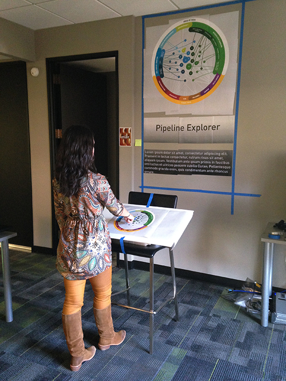
After determining your final resolution, print, trim, tile, and tape it all together for a direct representation of your design at scale. We are usually asked to make ergonomic recommendations for our fabrication and construction partners, so a physical mockup also helps to adjust the angle of interaction surfaces. In our guerilla usability testing, we found that most users felt more inclined to interact with the touchscreen if it were angled more like a drafting table than if it were more perpendicular to the floor. That’s the kind of news we can use.
The client wanted the background to visually tie directly back to the scientific visualizations used elsewhere in the booth. We opted for an option so simple we almost didn’t think to do it: use pre-rendered graphics as the background. We did this so our developers could focus on building a killer runtime experience: this approach required almost no development effort, and freed up CPU resources for the interactive portion of the experience. For the particle system, we used the Trapcode Form plugin for Adobe After Effects. Genentech provided molecule graphics that we isolated and animated ourselves, mixed with subtle particles floating in suspension. To prevent hours of hand-animating geometric drift and wobble in the particles and molecules, we wrote Expressions in After Effects, Javascript-like code snippets that handled geometric, repeating animations for us. Even our pre-rendered content was animated using code.
Because we used curved typography in our design, we needed to embed the text into the buttons as image assets for our developers. At the time of this writing, few coding frameworks support dynamic type on curved baselines with smooth rendering and letter spacing. To prepare these images for our developers to use, we would have had to save out almost 100 separate assets, one at a time. Instead of spending hours doing that, we found a Javascript plugin for Adobe Illustrator, by Thomas Byrne, that exports separate layers as individual assets, all at once. This plugin alone saved us days of work.
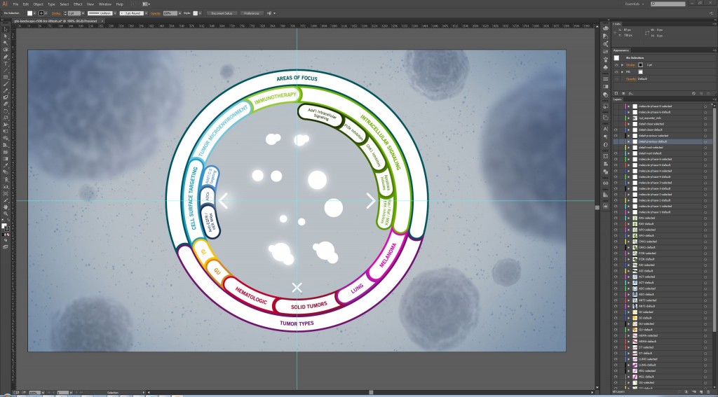
Each layer on the right hand side would have had to been saved one at a time without Thomas Byrne’s plugin
Stimulant usually relies on powerful, “close-to-the-metal” graphics frameworks like Cinder to create its digital installations, because we’re usually pushing incredibly intense graphics to very large displays in real time. However, we decided to build the Genentech Pipeline Explorer in HTML5 and JavaScript to take advantage of a data visualization library called D3. Despite our status as a post-Web studio, HTML5 has become hardware accelerated on most platforms in the last few years, and the speed of development – and the ease of creating typography and visual assets – felt like the right decision.
Using HTML5 also made it easy to send usage data to Google Analytics. Providing these analytics helped their BioOncology team better understand in which molecules, tumor types, and areas of focus ASCO attendees were most interested. This further helped them verify the effectiveness of their other marketing and education efforts among oncologists at the conference.
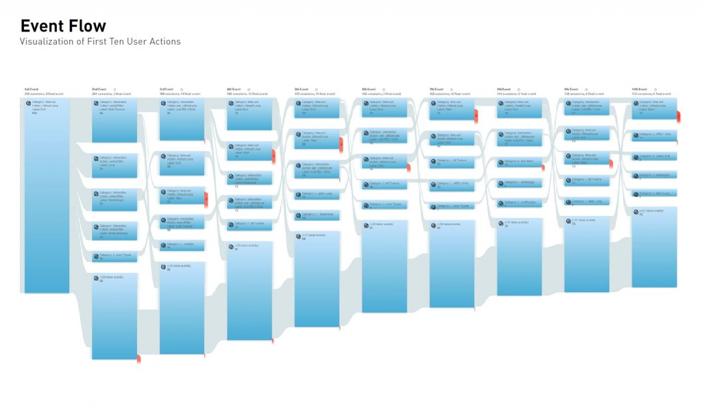
This project is not just about being beautiful and bulletproof, but providing the information that attendees need to continue cancer research. Our approach allows people to sort through information quickly on a molecular level while maintaining the ability to view and explore the entire pipeline data at a high level. We hope this tool will continue to serve the community with info they need to advance their hard work. Keep fighting the good fight!


